Making a book activity 3: what do you want your diary to look like?

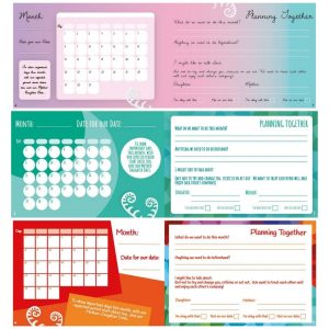
Here’s two pages from the diary in three different designs. Which one do you like best? Please tell us in the comments below which design you’d like to choose for our diary and why you’ve picked that one.
When we’re deciding what the diary will look like, who do we need to be thinking about? Who’s going to be using the diary? They’re going to have to like it! But it’s going to be mothers and daughters together so how do we make sure it appeals to both of them? And won’t it depend on how old the girls are and what sort of styles they like? Then we need to think about the design of the book fitting with Tanja’s pictures, the dog and the dragon. So many things to consider!
Three designs to choose from – vote in comments.

What are these pages for?
These two pages are for planning your Mother-Daughter Dates
How do you organise your life? Do you like making lists? Do you prefer to allow things to unfold? Perhaps you’re best when there’s a deadline, or do you prefer to organise yourself in advance… We all have our own way of organising our lives and there’s no right or wrong way. What’s interesting is when two people want to organise something together and if they each organise differently.
When arranging your Mother-Daughter Date you’ll need to figure out how to plan together and these pages are designed to help you.
We’re four women creating this diary, along with hundreds of you and we’re learning how to work together too…
Meet Lauren, our graphic designer
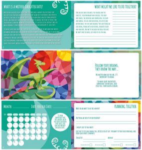
Winner: the green one!

We’ve had some great feedback from you, thank you. The green one was a firm favourite but to finalise the overall design we’ve taken into account your comments about all three designs. Take a look at how we’ve used your feedback to make a few more pages of your diary.
The first spread will come at the front of the diary explaining Mother-Daughter Dates. The second and third spreads show you the first two pages that we’ll have each month: a piece of artwork and the theme, followed by that month’s calendar and your planning. There will also be pages to record your date followed by our favourite page, you rate the date!
Please tell us what you think.
Help us to design the front cover in a few weeks time, and coming up this week there’s a colouring-in activity on friendship…


54 Comments
We vote for the middle option x
I like the middle design the best. It is clearer to read, I like the colour and I like the circles for the dates.
Yes, I second that! Middle one is very clear but also a nice design.
we like the top one best, Sophie and Sarah
We like the middle one thank you Claire and Olivia
We like the middle design best,
And the dragon from last week is wonderful
Paola (and Lea)
My Mom and I like the first one. Love the dragon drawings from last week
Check back here next week Jessica to see how we’ve used everyone’s feedback to develop the design. We’ll show you how your favourite design looks on a few more pages too.
I like the green one in the middle. ??!
My favourite is the third design (the red one). I think this compliments Tanja’s artwork and gives a feeling of fun and brightness. I struggled to read the font on the first one (the pink one), and feel that the middle green one is too similar to the current diary. My vote’s with design no. 3!
My daughter and I both really like the middle one! We found the font in the top one too difficult to read easily! Thank you x
I like the middle one, love the colour x
I like the bright red and orange one at the bottom. Not my usual colours of choice, but it really stands out on the page and looks really bright. This is fun!
We like the green one in the middle. We like the colour (we think it’s colour that’s hard not to like), the writing is easy to read, and we like the round dates.
I love the bright red, really eye catching!
We like the middle green one
I like the green one. The pink one is nice too but rather girly! Don’t like the red, it looks too formal
We like the middle one, the Green. The font is neat and tidy and easy to read without being too fussy. The colour is very calming.
I personally like the top one but think the middle might appeal to broader range of tastes.
Font and layout of the top one but the colour doesn’t really matter. Green is soft, red is engaging. But the handwriting font is nice. Each month could be a different colour or tone.
Green design layout is the best as clear text but with modern UI feel to it. However colour scheme is not great, best colour scheme is the pink / purple shades as any writing will stand out well in that diary colours. Darker shades such as green or red colours will be too bold when handwriting in a diary. Should add, design should also reflect age range….italic writing most suitable for teenagers to adults, clear but modern text on green is suitable for tweens to adults
The layout and colour of the top one but I found the font very difficult to read.
I like the layout and color of the top one best! The layout feels more like a journal than a homework assignment and the color is just pleasant
The second one, by far. I lime the colour, the font, and the circles rather than grid lines.
We like the top one best
Daughter aged 11 loves this sort of thing (but dislikes pink as a standard for girls) and we like the green
Me and my daughter like the top 2 and my son likes the red one xxx
I like the top version, it is a very calming tone and blends well, by using the pale colour all over rather than in sections and rigid boxes this encourages the user to Express their feelings without the boundaries of a few lines to write on, the user can add additional comments anywhere on the page if it is a pale background.
I like the box with information as it is an ideal place for inspirational comments, the box draws your eye to the information.
I hope this helps.
Xxx
We like the top design but with colours that reflect some of the artwork rather than mostly pinks and purples, so it appeals to all sorts of girls.
Agreed about the font, something clearer and more fun, and to support different reading abilities.
Green
I like the top one colour wise but the font used in the 2nd as the 1st I find hard to read.
The second one, by far. I lime the colour, the font, and the circles rather than grid lines.
The green one has the nicest fonts too ?
Definitely number 2 – the green one. It’s the most stylish, nicest colours and also calming & relaxing to look at. I think it would appeal to mothers & daughters. And a mothers main concern is that her daughter likes it. The purple one looks like it’s for old ladies and the red one looks too young and red is a bit stressful.
The green one for sure because it just makes me think of rites for girls when I see it and it is a calming colour xx?
I like the green one and the pink one x
I like the green one, but maybe it could have the same rounded box shape as the pink one?
Green one, definitely ! Although the text type on the pink is really lovely too..??
Number 2. Goes well with the colours of your website xx.
We agree, number 2 is our favourite as well but maybe with the colourful border on the right like in number 3? ?
Number 2. Good Colours, fonts and feel
Daughter likes Green or red. We had an interesting chat what ‘acting out’ was.
We’re curious, what did you decide ‘acting out’ was?
The explanation that she understood was distinguishing between ‘showing’ behaviour and telling. She’s understood it as a twist on a phrase learnt in year 6 grammar – avoiding ‘show not tell’!
We’ve had some great feedback from you, thank you. The green one was a firm favourite but to finalise the overall design we’ve taken into account your comments about all three designs. Take a look at how we’ve used your feedback to make a few more pages of your diary.
The first spread will come at the front of the diary explaining Mother-Daughter Dates. The second and third spreads show you the first two pages that we’ll have each month: a piece of artwork and the theme, followed by that month’s calendar and your planning. There will also be pages to record your date followed by our favourite page, you rate the date!
Please tell us what you think.
Yay! I love the colour ?
They look great together !
Oooh beautiful… that’s the one my daughter wanted (I voted for red!)
We’re so glad your daughter got her choice and we took your comments into consideration and added some more colour to the borders on the monthly pages.
Thank you! We can’t wait to see the finished product
Really lovely! I voted for red but that looks great!
So glad you like it Lisa. We listened to those of you who liked the colourfulness of the red design and hope you feel that we’ve added some of that to the green one.
Rites for Girls absolutely! It blends both the Rites for Girls colour and Tanja’s artwork brilliantly. Perfect ?
This is amazing! Such a great idea. ?
and it works wonders for a girl’s self esteem. You can tell her til you’re blue in the face how much you love her but we hear girls just say, “course she’d say that, she’s my mum.” But make a monthly commitment to spend special time with your daughter and she’ll definitely feel good. We see the transformation time after time. So simple but so effective. Read chapter one of Kim’s ‘From Daughter to Woman’ for everything you need to know about mother-daughter dates.