Making a book activity 12: The book cover

First impressions count. How would you like the front of your diary to look?
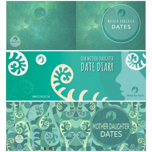
Tell us in comments below which of the two designs (below the top one) that you like best. We’d also like to hear why it’s your favourite and if you have any suggestions for how to make it look even better.
Remember it needs to appeal to girls and their mothers. It also needs to be clear from the cover what it is and who it is for.
The designs all include the front cover (to the right) and back cover (on the left). Ignore the first one, it’s the cover of the diary we’ve already published just to show you.
Choose the cover for our diary

There is no winner!
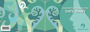
Reading all your comments there was no clear favourite so we’ve combined the two designs. Then we used some of the adaptations that you suggested. What do you think?
This is a work in progress. The book cover is such an important part of this project that we’re going to give ourselves longer to develop the finished design. Our artist and designer are both working on the cover together and they’ll follow your suggestions. We’ll keep you updated as the cover evolves.
So, please let us know what you like about this version and what you would change.

Everyone who contributes to our diary is entered into our draw to win a copy of the Mother-Daughter Date diary that we’re all making together.


26 Comments
Molly says the bottom one and I think that one too! X
I like number 2 but not the font. Perhaps evening the size of the fonts would help.
Maddie likes the middle one and I like the design on the bottom one but with the wording from the middle one!
Number 2!
I like the lowest design best because I like the pattern also I find the other one quite simple ❤️
We like the second style. The background is more fun. (The first one feels a bit clinical) There’s something not quite right with the circle area. I would suggest a lighter shade. It may look better with the font being the darker colour. Good luck with your design!
We like the middle one – simpler and more striking
9y/o – the bottom one because it’s all ferny, colourful and fun
I like the first one the best because it is simpler and I think that the way it is designed appeals to both mothers and daughters. (The middle one in the picture) age 12
I like the top one.
I like the second one, but i feel it needs a little something, maybe some sparkle or a butterfly
My dd likes the top one but thinks it would be nice if “dates” was in a more flowy font to go with the background. The middle one she says is a bit more fun. The bottom one is too busy.
I like the top one but would like he circle lines to be a bit stronger colour if possible. I love the colour palette of the bottom one but it is a bit busy.
The middle one for me ?
I really like the bottom one the most, followed by the middle design. I think I must really like the ferns! I like the wording of the middle one, it feels more personal. Would you consider doing a ‘family date diary’ so we could use it with other family members too? I’d still like to have this special one just for mums and daughters though. It means so much.
Yes, we have plans for a adult-child diary that could be used by mothers and fathers, grandparents, aunties, uncles, godparents and mentors with a boy or girl.
Number 3 ?
I like the bottom one most ?
The bottom one is my favourite ❤️ it’s very colourful and interesting to look at and it matches the rest of the artwork in the book. The only bit I’d change is inside the circle I’d take out all the underlying pattern just leaving the ferns.
I like them both just as much as each other. Can you make two new diaries so we don’t have to choose?
If I had to pick, it would probably be the last one, But I keep changing my mind!
I agree with the person before about the bottom design, take out all those thin lines inside the circle because it muddles the title.
I like the title of the middle one best (but not the font). The yellow fern bits look a bit funny on the front cover though, cos you can’t see that it’s part of a big fern on the back.
Third design – the amalgamation – lovely well done xx
The third one beautiful ??
Love it too… very fernlike!
The new design, the amalgamation one has the logo and the young face reminds us the focus is on the daughter overall. The roundness of the shapes and not too varied colour keeps it simple and clear. The tendril offers potential growth.
Hope that helps.
I think Lyndal’s points are on point as my daughter would say. I have a couple of other thoughts to offer.
The colours in both the new ones seem rather too subdued to me. Could they be lifted? The brighter turquoise and greens emphasised? A little magenta in there perhaps as has been on some artwork previously.
I feel the original logo with the white ring and face might work better too – to lift the colours.
The font in the original is more fun and appropriate for the diary.
Having said all this I do love the designs!
Like the title “Mother Daughter Dates” better than “Our Mother Daughter Dates” & font in previous 3rd version is softer. Prefer the smaller ferns in 3rd version to new version too. Xx
I like the 3rd version from before…It’s vibrant, exciting and the MDD title is the clearest to me.